In the previous post, I started to talk about my recent Power BI experiences., but I kind of stopped half way through. There were 3 visualizations on the report, two of them were slicers connected to the date table, and, yet, there was the main visualization which, at that point, was not, yet, filtered by the date selected in the other two:

This is another thing (which would be obvious now, but was not, at first![]() ) which is interesting about Power BI, and, I guess, all of those data analysis tools.
) which is interesting about Power BI, and, I guess, all of those data analysis tools.
You can have data coming from different datasets, and, then, you can define new relationships in the model. It’s through those relationships how the filtering gets applied in the end.
So, basically, you just need to go to the “Model”, add a relationship, switch back to the report and see how it’s all working – here is an example:
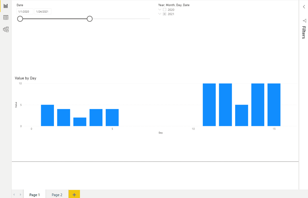
That’s pretty simple and straightforward once you know what to do – I almost wish we had this kind of modeling / filtering capabilities in the model-driven apps (would be nice to have the ability to filter subgrids based off the main form context in the broader sense… not just by the lookup / hardcoded view)
Anyways, now that this is working with the simple dataset, re-implementing the same for the original Tesla stock report is easy now.

That visualization is using a line chart, there is a Date table in the report, there is a relationship between that date table and Tesla Stock table – in that sense it’s all the same.
There are two additional features utilized there, which are:
- A measure
- A calculated column
To be honest, I’ll need to spend more time on this myself first, but, if you need more details right now, I feel this article would be a great starting point:
https://www.sqlbi.com/articles/calculated-columns-and-measures-in-dax/
In the meantime, just to complete this story so far, here is how that measure for the rolling average could be defined:

That’s for 104 days, but, of course, could be for any number of days. And that’s the purple line on the chat.
I think this is where the crash course ends – a lot of learning remains, that’s if I ever wanted to become a data analyst. Which is not necessarily what I want to be moving forward, so will consider this mission to be accomplished for now![]()