It’s been a while since I wanted to try using Power BI for something practical. And this is not to say there are no practical applications for Power BI![]() It’s all about me being a Power Platform consultant who is working primarily with model-driven applications, and, every now and then, with Power Automate and Canvas Apps. Power BI has always been something I wouldn’t ever need to touch.
It’s all about me being a Power Platform consultant who is working primarily with model-driven applications, and, every now and then, with Power Automate and Canvas Apps. Power BI has always been something I wouldn’t ever need to touch.
That’s until Power BI Paginated Reports became a new reality of my life, but that was still pretty much SSRS with different deployment and licensing model.
And, so, I was wondering what it is I can do with that other, “classic”, part of the Power BI?
So I figured why don’t I do something… as in, why don’t I try looking at the Tesla stock prices and see if I can get some analysis done? So that I ‘d get at least this kind of visual:

You can see that it actually worked out, but it turned out to be way more involved that I thought it would be. And I have to admit something, by the way. While working on this, I learned to have great respect for for what this kind of tools can do to your data, so, even if only for that, if you have not done a lot with Power BI yet, you might try spending some time figuring out how to build this kind of chart, what’s involved there, and what tools are, actually, available in Power BI for that.
The reason I called this experience a crash course is that it literally was it. For every step in the process I had to do some reading, had to watch a couple of youtube videos along the way, and had to do some R&D with a more simple dataset.
Well, one can easily get historical stock prices from Yahoo finance – that’s not a problem at all:

What happened next is the interesting part, and I’m going to walk you through the steps (which should also help me understand those steps better myself), but I’m going to use a very simple dataset for that.
Why? Having run into a few questions with the larger dataset, switching to this kind of simple one seemed to be the easiest way to figure out how things work in Power BI. Here is the dataset:

Why is there a gap between Jan 5 and Jan 11? Since I wanted to count moving average among other things, and, this way, it should be easy to check the numbers.
Why is there a value for Jan 1 2020 while all the other values are for 2021? We’ll get to that – it has to do with date hierarchies in Power BI.
Either way, here is what I wanted to achieve:
- A chart for the value
- A chart for the moving average
- Date filter
So, first things first, let’s create a new report, load data into it, and create a simple visualization:
The end result might not be great yet, I probably need to add filtering. Otherwise, because the data spreads across 2 years, each individual bar is way too narrow.
Filtering can easily be done with a Slicer:

We add new visualization to the report just above the existing one, add Date field to it, and, just like that, we can now choose the date range:

But wait. That’s a different visualization, isn’t it? So how come the first chart is also affected as I start moving the slicer back and forth?
Well, this is because slicers are offering another form of filtering. Once you have a slicer, you can define which visualizations on the same report page will be affected by that slicer, and this is done in a few simple steps:

Select that slicer visualization, choose Format->Edit Integrations, and, then, select the visuals you want to be affected by the slicer.
Although, by default all of them on the same page will be affected.
But, then, it’s not for all visualizations on that page – it’s only for those which are linked to the same dataset. Although, there is, also, the topic of relationships – we’ll get to that.
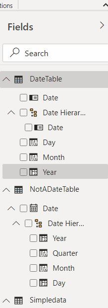
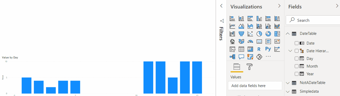
What we have so far is a report page, but there is one interesting aspect of how Date fields are treated by default in Power BI. Have you noticed those date hierarchies yet? That almost gave me a headache, to be honest. Just have a look at this:

This is what happens when we start using “Date hierarchy” offered by Power BI by default. And this is why I wanted to have that single value from 2020 in my dataset. See how the first bar is displaying the value of 5? That’s because, when aggregated by day, there are 2 values in the dataset that correspond to the first day of the month. In other words, that default hierarchy is not looking at the days of the year – it’s just looking at the day numbers. Is it the first day? Awesome. There are 10 years of data, 12 months per year, so that’s about 120 day ones… All corresponding values will be aggregated, and, then, the result will be presented on the visual. That’s, of course, not exactly what I need for this particular report, since I would not want values from different years/months/days to be aggregated that way.
Any options?
It seems there could be more than one, but, generally, one could create a Date Table. There is a lot more to say about it, and you might want to look at the documentation on the Date Tables, but, to start with, we actually need a new table:

If you look at how the table is defined (#3 on the screenshot), you’ll see a DAX expression which is using a CALENDAR function.
So… what’s DAX to start with? That’s Microsoft’s “Data Analysis Expressions”. It’s a huge topic in itself that goes well beyond my “crash course”, but, just to clarify what’s happening above, it’s all about creating a table that has all the dates from Jan 1 2020 to Dec 31, 2021.
Once the table has been created, Power BI automatically throws in a Date Hierarchy (#4 above), and that hierarchy is following the same pattern as any other default date hierarchy. Did not I want a different one?
Yep, so this is where “Date tables” come in.
I’ve created another table, which is called “DateTable”, and the only difference is that I marked it as a Date Table:

There are more details in the docs, but what it does is: it removes default date hierarchy from the table, and, instead, we are free to add our own.
At which point you may want to ask: “so what? We are creating a completely separate table, what does it have to do with the original idea of having meaningful day/month/year filters”?
We’ll get to that, and it has to do with setting up the relationships. But, for now, let’s continue with the table.
First, I’ll add a new hierarchy for the date fields:

That hierarchy does not, yet, help that much. So, let’s add a few calculated columns:
- Year
- Month
- Day
Here is how it’s done:


Below are the expressions for each:
Year = Year(‘DateTable'[Date])
Month = Year(‘DateTable'[Date]) & “-” & Format(MONTH(‘DateTable'[Date]), “00”)
Day = Year(‘DateTable'[Date]) & “-” & Format(Month(‘DateTable'[Date]), “00”) & “-” & Format(Day(‘DateTable'[Date]), “00”)
What it gives me is unique year / month / day values so I can actually use them for filtering without values aggregated incorrectly.
That’s because, for the “Month”, a year is added to the month #. And, for the “Day”, both year and month are added.
The last step is moving those fields to the Date Hierarchy, which is easy to do – just need to drag & drop:
Now let’s use that new table to create a couple of slicers and see how it all works now:
The first slicer above is using Date field. The other one is using Date Hierarchy. They are both “connected”, and the “Hierarchy” one is showing Year/Month/Day values which make sense for the aggregations. But, as you have probably noticed, those slicers have no effect on the actual data visualization.
And this is because there is no relationship, yet, between my new DateTable and the original SimpleData table.
I think that’s been a long enough post already, though, so we’ll get to the “relationships” soo, but it’ll be in the next post.
Have fun!